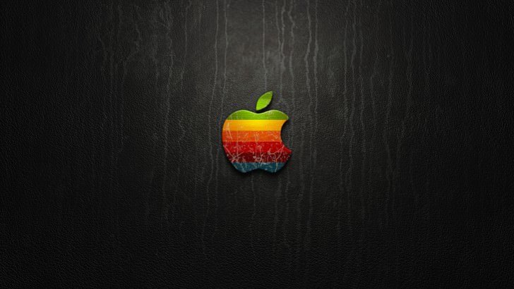
Apple is one of the most well-known companies in the world, and as such, its logo is among the most recognisable of any global brand.
Apple couldn’t have chosen a more appropriate name for its laptops, phones, and tablets.
People are still confused about the branding. Most notably, why is there a bite taken out of the Apple?
There are numerous theories, one of which is linked to the British mathematician Alan Turing, who played a critical role in cracking intercepted coded messages, allowing the Allies to defeat Nazi forces in a number of key battles.
However, it is entirely false, as are many of the best theories.
Here’s the real reason for the Apple logo.
Why does the Apple logo have a bite?

There are numerous theories. Some believe it is a reference to the computing term byte, others believe it is a nod to the biblical story in which Eve ate the forbidden fruit, and still, others believe it is a reference to Sir Isaac Newton and the apple that fell and helped him discover gravity while sitting under a tree.
Unfortunately, the reality is less exciting.
During an interview with Creative Bits, the logo’s designer, Rob Janoff, stated, “They are really interesting, but I’m afraid it had nothing to do with it.”
“From a designer’s perspective, one of the major phenomena is the experience of designing a logo for whatever reason you design it, and then discovering years later supposedly why you did certain things.” And they’re all nonsense. It’s a fantastic urban legend. Someone starts it, and everyone says, ‘Oh yeah, that must be it.’
“I designed it with a bite for scale, so people know it’s an apple, not a cherry.” It was also kind of iconic to take a bite out of an apple. Something that everyone can enjoy. It transcends cultures. If anyone has ever had an apple, he has most likely bitten into it and this is what you get.
“After I finished designing it, my creative director told me, ‘Well, you know, there is a computer term called byte.'” ‘You’re kidding!’ I exclaimed. So it was almost perfect, but it just so happened to be a computer term.”
Why was the Apple Logo multicoloured?
The Apple logo had six horizontal, multicoloured stripes when it was first designed in 1977. These have since been replaced by a more modern design, but some have speculated that the original design was related to LGBT+ pride.
In reality, founder Steve Jobs liked how the colours made the logo pop. However, a theory about Alan Turing’s bite and stripes has emerged and grown in popularity.
Turing, a computer science pioneer, was homosexual. He was charged with gross indecency for homosexual acts in 1952 and committed suicide in 1954.
“I heard one of the legends being that the coloured logo was a homage to him,” Mr Janoff explains. People believe I added the coloured stripes to represent the gay flag. And that was something I had been thinking about for a long time.”
Leave a Reply