Table of Contents
Best Font Size for Blog
Have you ever wondered which font will be best for your blog, and what is the best font size for Blog? You may be or maybe not realize, but font settings for your blog make a huge impact on the readers who visit your blog to consume content.
Typography is all about the arrangement of the letters, and good typography should feel effortless, like any other design aspect. The visitors always like to read an article where they find every word visible with appropriate font size. An article with a proper font size attracts the right audience.

Why font size matters
If all fonts are the same size, visitors do not understand what information is the most important one on a page. Write content with different styles, and sizes of fonts help to create a flow of importance for the readers. The bigger and bold font size will attract visitor’s attention immediately as soon as they land on the page.
Make important information bold and higher position on the page, and the reader will definitely go and read it, if not a complete article.
On the other hand, the wrong font size adds frustration to the reader, and they will jump from the page, which will decrease the session duration, and page bounce rates will go high. So, optimize your website with the right font sizes, since it is a primary requirement of your site.
A bigger Font Size works better
Try to write an article with bigger fonts; many designers recommended 16pt is an ideal size for the content (Example: Medium.com) Though, you can increase the font by 18pt as well, if you still feel the font size is small.
The first 3-4 seconds of reading is crucial since the reader decide whether he continues to read the article or jump to another one; bigger fonts let visitors attract and make them understand what they are going to receive from the content since the larger font is more visible than the smaller ones.

Difference between a Typeface and a Font
It might be confusing at the start, but when you have gone through the difference between a typeface and a font, it’s become quite simple to understand.
To make you understand clearer, a font is a complete character set within a typeface, whereas a typeface consists of different categories of fonts. There are many typeface styles, but we are briefing about the most popular ones hereinunder:
Serif

These are the typefaces with feet, meaning having a short line on the top as well as at bottom of each alphabet. These fonts are much easier to read when using with a bigger font size, but getting hard to read when used in small font.
Normally, it is used in printed works, like newspapers, books, etc.
Examples of Serif fonts are Times New Roman, Georgia, and Garamond.
Sans Serif

“Sans” means without, there Sans Serif fonts are without feet, or you can say without a short line on the top and bottom of each alphabet. These typefaces are having a much modern feel and look decent at lower screen resolutions as well. Popular for blog posts and web documents etc.
Examples of Sans Serif fonts are Arial, Verdana, and Futura.
Blackletter

Blackletter typefaces are popular for their dramatic effect and characterized by thick and thin strokes and spin on serifs. You will find these fonts in the old manuscripts. This typeface is commonly used in logos and other signs or symbols.
Example of Blackletter fonts are: Old English, Fraktur, and Linotext
Script

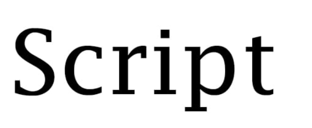
The script is mostly used for designing invitations, banners, posters, logos and etc. Designers used in the heading, but avoid to use for the body text, since it is hard to read for a reader.
Script has two basic distinctions, i.e. formal and casual.
Examples for Script fonts are Platinus Script Pro, Kuenstler Script, Quarzo, Mistral, and Brush Script.
Decorative

Decorative fonts fall under high stylized category typefaces. These fonts should be used with a lot of fun and pleasure. Recommended only for decorative logo etc., but never for headlines or body text, thinking that looks nice.
Examples of Decorative fonts are Outlaw, Stencil, Letterpress, Pinto, and Bauhaus.
Some basic rules of Typography
Don’t think that you have to know everything in detail before the start; in fact, start with some basic steps of typography and keep growing with your learning while you work consistently. There are some simple and elementary steps that you can start with and ensure to utilize typography for your blog.
Don’t try too many fonts
Don’t use too many fonts in your blog, many experienced recommended 2-3 fonts throughout your website and blog. This is the most common mistake bloggers do with typography.
Instead of trying so many fonts on your blog, stick with 2-3 fonts all through your website and blog.
If you are looking to use more than one font on your website, always choose fonts within the same font family since they complement each other.
Choose the right font
While choosing fonts for your website and blog, go with the font which looks simple and easy, regardless of font sizing. The right font is the one that readers can engage with and read content comfortably, without any problem at all.
Make sure that the font type you choose is connecting to your audience at best. Study your audience, where they are coming from, what they would like to read, and then choose a font accordingly that works best for them.
Align your content
A jumble article will also make a bad effect on the readability of the content. So, make sure that you choose correct alignment throughout, as it will help your readers to get neat and clean content.
Left alignment – Keep your content left align, as it is the most common alignment that people used.
Centre alignment – Commonly used for images, quotations, branding, etc; easy to read and highly visible.
Right alignment – Not recommended for larger text
Justified alignment – Looks well-formatted and neat & clean content, good for long-form, though it might have problems with the spacing.
Make full use of Headings
The table of content will be quite useful for the reader, as you will show a path for your readers to follow. Create your content in a hierarchy form, make full use of headings (H1, H2, H3, and H4) as it will help your reader as well knowing where to look first and follow accordingly.
Create subsections throughout your post, so the content didn’t look jumbled.
Conclusion
So, you have the basic steps now, go and create your own content for your blog, with proper use of typographic designs.
Choose the right font before you get into writing an article; a beautiful font always attracts readers to get engage with your website and blog. Let me know your feedback on the comments section below, we love to hear from you.
Read More…
What is Event Blogging – Event Blogging Tips
Leave a Reply